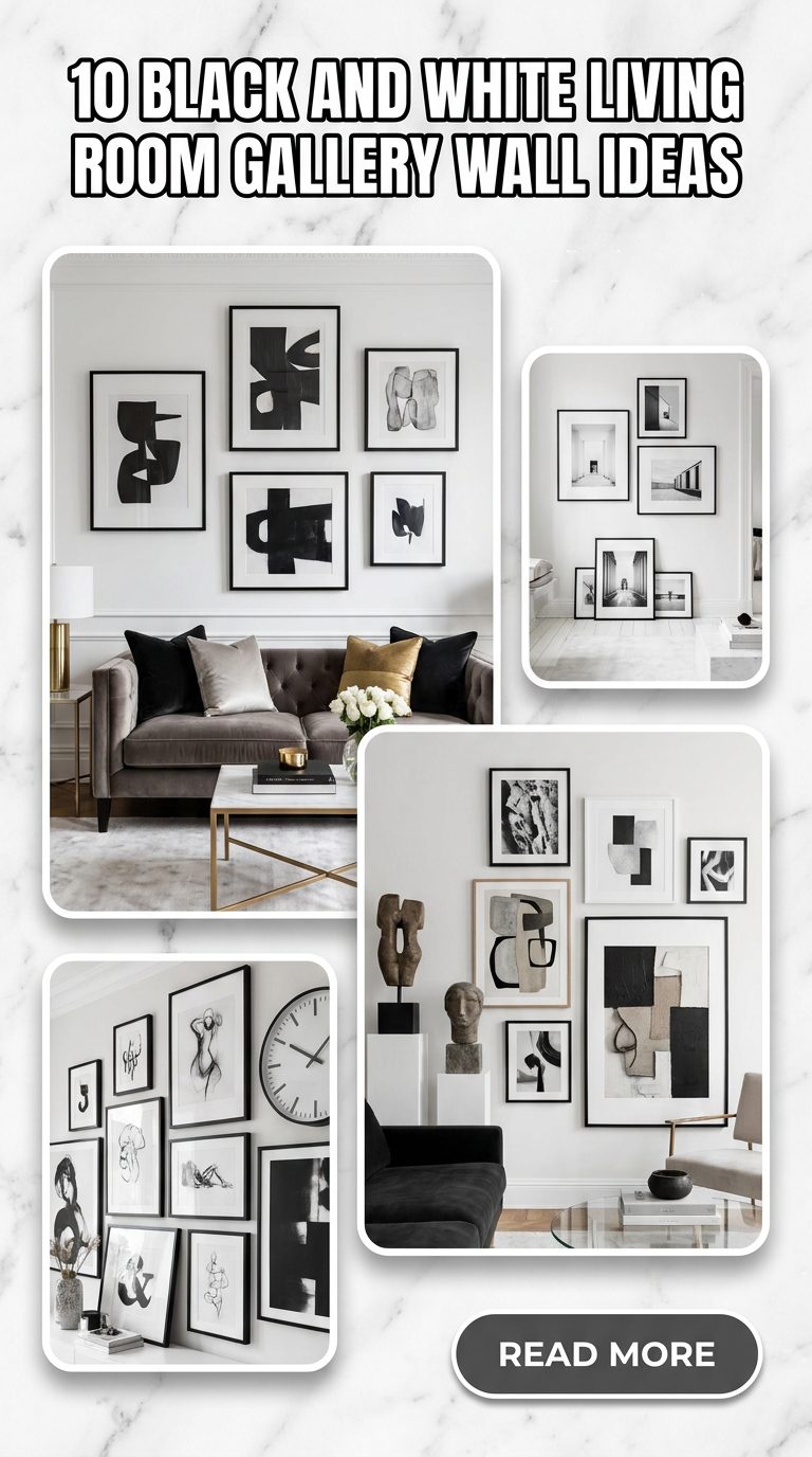
The timeless elegance of a black-and-white color palette is unmatched. When applied to a living room gallery wall, this classic combination transcends shifting interior design trends, offering a sophisticated, cohesive, and deeply personal focal point. Whether your style leans toward sleek minimalist modernism, rustic warmth, or high-drama eclectic glamour, a monochrome gallery wall can effortlessly anchor your space.
Curating the perfect collection involves balancing contrast, playing with textures, and choosing the right framing strategy. Here are 10 inspiring black-and-white living room gallery wall ideas to transform your blank wall into a curated masterpiece, followed by tailored prompts to help you visualize them.
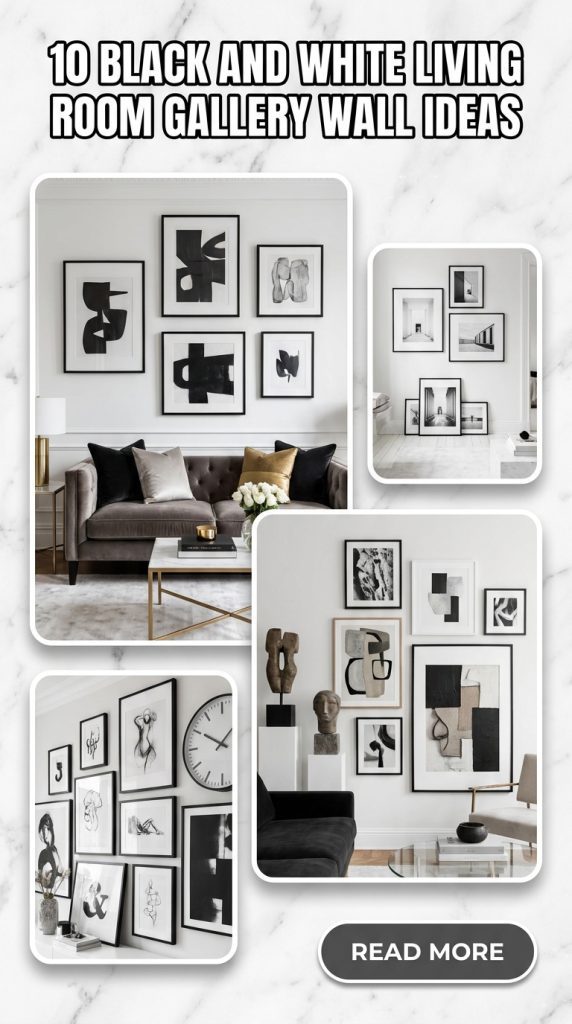
1. The Perfect Grid
For lovers of order, symmetry, and clean lines, a structured grid layout is the ultimate choice. This approach relies on precise alignment, using identical frames and matching mat boards.
- The Look: A $3 \times 3$ or $4 \times 4$ grid of square black frames containing minimalist black-and-white architectural or botanical prints.
- Why it works: The repetition creates a sense of calm and architectural stability, making it ideal for formal living rooms or minimalist spaces.

2. High-Contrast Eclectic
If a rigid grid feels too restrictive, an eclectic layout allows for a dynamic narrative. This style thrives on variety, mixing different art mediums while keeping the color palette strictly monochrome.
- The Look: A curated jumble of charcoal sketches, abstract ink blots, vintage family photographs, and bold typography prints.
- Why it works: By mixing different frame sizes, thicknesses, and even textures (like combining matte black wood with distressed silver frames), the wall becomes an engaging visual storybook that invites guests to lean in and look closer.

3. Oversized Statement and Mini Companions
Sometimes, one piece of art deserves the spotlight, but a single frame can look lonely on a massive living room wall. This design uses scale to create immediate visual drama.
- The Look: One massive, sweeping abstract canvas or landscape photograph takes center stage. Off to one side, a cluster of two or three much smaller, tightly grouped frames balances the composition.
- Why it works: It breaks the predictability of traditional gallery walls, leaning into asymmetrical balance to create a thoroughly contemporary, gallery-like atmosphere.

4. Vintage Sepia and Charcoal Infusion
“Black and white” doesn’t have to mean stark ink and blinding white paper. Introducing softer, warmer tones can give your living room a cozy, lived-in feel.
- The Look: A collection featuring soft charcoal drawings, vintage sepia-toned street photography, and creamy off-white mats housed in ornate, slightly weathered black or dark wood frames.
- Why it works: The softer contrast prevents the wall from feeling too cold or sterile, making it a perfect match for transitional, traditional, or bohemian living rooms.

5. The Floor-to-Ceiling Salon Wall
If you want to make a bold architectural statement, use the entire height of your room. A salon-style wall feels deeply intentional and incredibly luxurious.
- The Look: Art stretching from just above the baseboard all the way to the crown molding, tightly packed together.
- Why it works: This technique draws the eye upward, creating the illusion of much higher ceilings. Because the art is restricted to black and white, a massive collection won’t feel overwhelming or chaotic; instead, it reads as a single, magnificent texture.

6. Linear Ledge Display
For those who suffer from commitment issues when it comes to hammering nails into the wall, picture ledges are a lifesaver.
- The Look: Two or three parallel black or white picture ledges mounted on the wall, with a variety of black-and-white framed prints layered and overlapped on top of them.
- Why it works: This layout allows you to effortlessly swap, rotate, and rearrange your artwork whenever the mood strikes, without ever patching drywall. The overlapping frames add a casual, dimensional depth to the living room.

7. Bold Monochromatic Typography
Art doesn’t always have to be pictorial. Words have power, and when styled correctly, they become striking visual elements.
- The Look: Graphic quote prints, single-letter monograms, and bold dictionary definitions styled alongside minimalist geometric line art.
- Why it works: The stark contrast of black text on white backgrounds injects a youthful, modern, and energetic vibe into the space. It is highly customizable and speaks directly to the personality of the home.

8. Seamless White-Out Minimalist
If you want your artwork to look like it is floating directly on the architecture of your home, the seamless white-out technique is spectacular.
- The Look: Ultra-thin white frames with oversized white mats housing delicate, minimalist black ink drawings or thin line art, mounted on a crisp white wall.
- Why it works: The frames melt into the background, leaving only the delicate black lines of the artwork visible. It is the epitome of quiet luxury and understated Scandinavian or Japandi design.

9. Dark Drama Shadow Box
Flip the script by leaning heavily into the dark side of the spectrum. This look relies on deep shadows and rich textures to bring mystery to the living room.
- The Look: Deep black shadow box frames containing 3D elements like textured black paper sculptures, high-contrast monochrome portraits with deep shadows (chiaroscuro style), and jet-black mats.
- Why it works: It adds incredible physical depth and a moody, sophisticated edge to the room, looking especially striking against a dark accent wall or paired with plush velvet furniture.

10. The Corner Wrapper
Who says a gallery wall has to stay on one flat plane? Wrapping your collection around an architectural corner is an unexpected way to define a space.
- The Look: A continuous flow of black-and-white framed photos that seamlessly transitions from one wall, across an inside or outside corner, and onto the adjacent wall.
- Why it works: It physically hugs the room, making a cozy reading nook or a sectional seating area feel incredibly intimate and custom-designed.