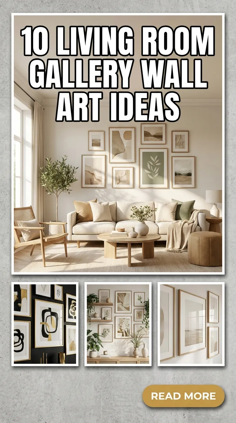
A living room gallery wall is more than just a collection of pictures; it is a visual narrative of your personality, experiences, and design sensibilities. It breaks up blank, intimidating drywall and serves as an instant focal point that anchors your entire seating arrangement.
Whether you are working with a sprawling high-ceilinged room or a cozy apartment nook, curating a gallery wall allows you to experiment with color, texture, and geometry. Here are 10 distinct design concepts to inspire your next home decor project, ranging from crisp and orderly to eclectic and organic.

1. The Ultra-Minimalist Grid
If chaos makes you anxious, the minimalist grid is your design sanctuary. This approach relies heavily on symmetry, precise spacing, and uniformity. By utilizing identical frames (typically thin black, white, or light oak wood) and matching oversized white mats, you create a clean, museum-like exhibition. The art itself should be simple—think single-line drawings, architectural sketches, or high-contrast black-and-white photography. This layout works beautifully above a streamlined, modern sofa.

2. Eclectic Vintage Eclecticism
On the opposite end of the spectrum lies the thrifted, antique aesthetic. This style thrives on variation. Gather a mix of ornate, tarnished gold frames, distressed wood, and frameless stretched canvases. The content should feel like it was collected over decades: oil landscape paintings, vintage botanical illustrations, sketchbook pages, and pages from old atlases. The trick to keeping this from looking messy is maintaining a consistent, warm color palette (like deep jewel tones, earthy ochres, and muted greens) across the disparate pieces.

3. Large-Scale Statement with Accents
You do not need dozens of small frames to make a statement. In fact, a highly effective layout involves choosing one massive anchor piece—such as an abstract expressionist canvas or an expansive landscape photograph—and flanking it with three to four smaller, supporting artworks. This prevents visual fatigue and gives the eye a clear place to rest first, before it wanders to the smaller details. Place the anchor piece slightly off-center for a modern, asymmetrical feel.

4. The Monochromatic Photography Studio
Black and white photography possesses a timeless, cinematic quality that instantly elevates a room. For this gallery wall, focus entirely on monochromatic prints. You can feature personal family milestones, architectural details from your favorite travels, or dramatic nature close-ups. To make the wall feel cohesive but dynamic, mix up the frame styles slightly—combine thin metal frames with chunky wooden ones—but keep all the mats white to bind the collection together.

5. Architectural Ledge Display
If you hate the commitment of driving dozens of anchors into your walls, picture ledges are the perfect alternative. Installing two or three long, floating shelves allows you to lean, layer, and overlap frames of varying sizes. This approach adds incredible physical depth to the room because the art physically juts out an inch or two. The best part? You can swap out art, add small potted trailing plants, or change holiday decor in minutes without ever touching a hammer again.

6. Mixed-Media and 3D Objects
Art is not restricted to flat paper behind glass. To truly make your living room wall pop, integrate three-dimensional objects into the layout. Woven seagrass baskets, ceramic wall plates, brass sculptures, or a small antique mirror can break up the hard angles of traditional frames. This introduces organic textures and shadows that change throughout the day as natural light moves across the room.

7. Moody and Dramatic Abstracts
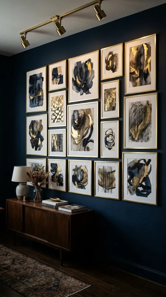
For living rooms painted in dark, sophisticated hues like charcoal, navy, or forest green, a moody abstract gallery wall is unmatched. Look for art prints that feature deep ink washes, rich acrylic textures, and metallic gold-leaf accents. Frame them in dark wood or thin brass to catch the lamplight in the evening. Keep the spacing tight (about one to two inches apart) to create a dense, cozy, wrapper-like effect on the wall.
8. Symmetrical Triptych or Quad Layout
Sometimes simplicity wins. A triptych (three panels) or a quad (four panels) consists of a single image split across multiple frames, or a series of closely related prints designed to be hung side-by-side. Think of a panoramic ocean horizon split into three frames, or four macro macro-photographs of different palm leaves. This look is incredibly sophisticated, easy to align, and brings an instant sense of balance and calm to a frantic household.

9. The Floor-to-Ceiling “Salon” Wall
Popularized in 19th-century Parisian art exhibitions, the salon wall utilizes almost every square inch of vertical space. Start a few inches above your baseboard and extend all the way up toward the ceiling. Because this style is so dense, it works best when it wraps around a corner or frames a specific architectural feature like a fireplace or a doorway. Mix oils, watercolors, textiles, and sketches to create an immersive visual tapestry.

10. The Warm Organic and Botanical Theme
Bring the outdoors in with a gallery centered around natural textures and botanical elements. This theme relies heavily on pressed fern frames, watercolor eucalyptus leaves, soft linen textures, and soft beige or terracotta abstract shapes. Pair these prints with light, unvarnished wood frames or hanging canvas scrolls. This approach instantly softens a room, making it feel bright, airy, and grounded.

Composition Tips before You Hang
- The Paper Template Trick: Before making a single hole in your wall, trace your frames onto brown craft paper and cut them out. Tape these templates to the wall using painter’s tape to experiment with layout, spacing, and balance.
- Eye-Level Rule: The center of your gallery wall (or the center of your main anchor piece) should sit roughly 57 to 60 inches from the floor, which mimics the standard human eye level used in museums.
- Mind the Gap: Keep your spacing consistent. For modern grids, 2 inches between frames is ideal. For more eclectic, larger arrangements, you can stretch the gap up to 3 or 4 inches.